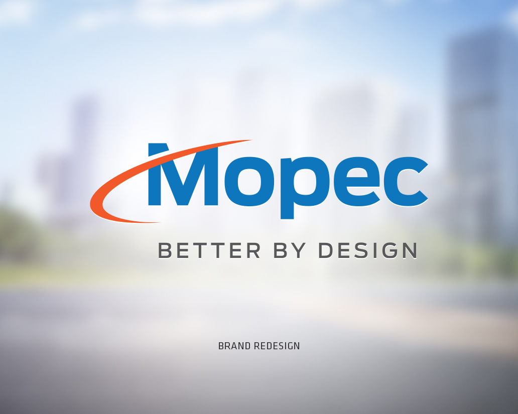
Mopec Brand Refresh
Mopec, Inc.
The new Director of Marketing reached out to us to re-tool product typography within the Mopec brand. We had worked together on a separate brand project for Ross Medical and were ready to start another. Searching for typography that would complement the brand type, Century Gothic, we developed some initial concepts based on a quick design brief over the phone.
After a brief review at the executive level we were tasked to explore redesigning the mark and typography of the brand itself. So with the brand mark open to change we were able to make some significant changes while keeping a nod to the brand legacy. The end product included all the brand elements, corporate stationery and examples of usage and templates to help the internal execution.
Mopec produced a video, once the project was complete, to celebrate the brand evolution over the years.
Category
Brand Identity


