Brez Packaging Redesign
Project Scope
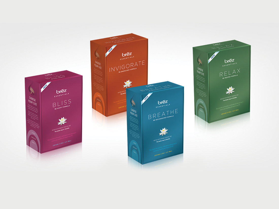
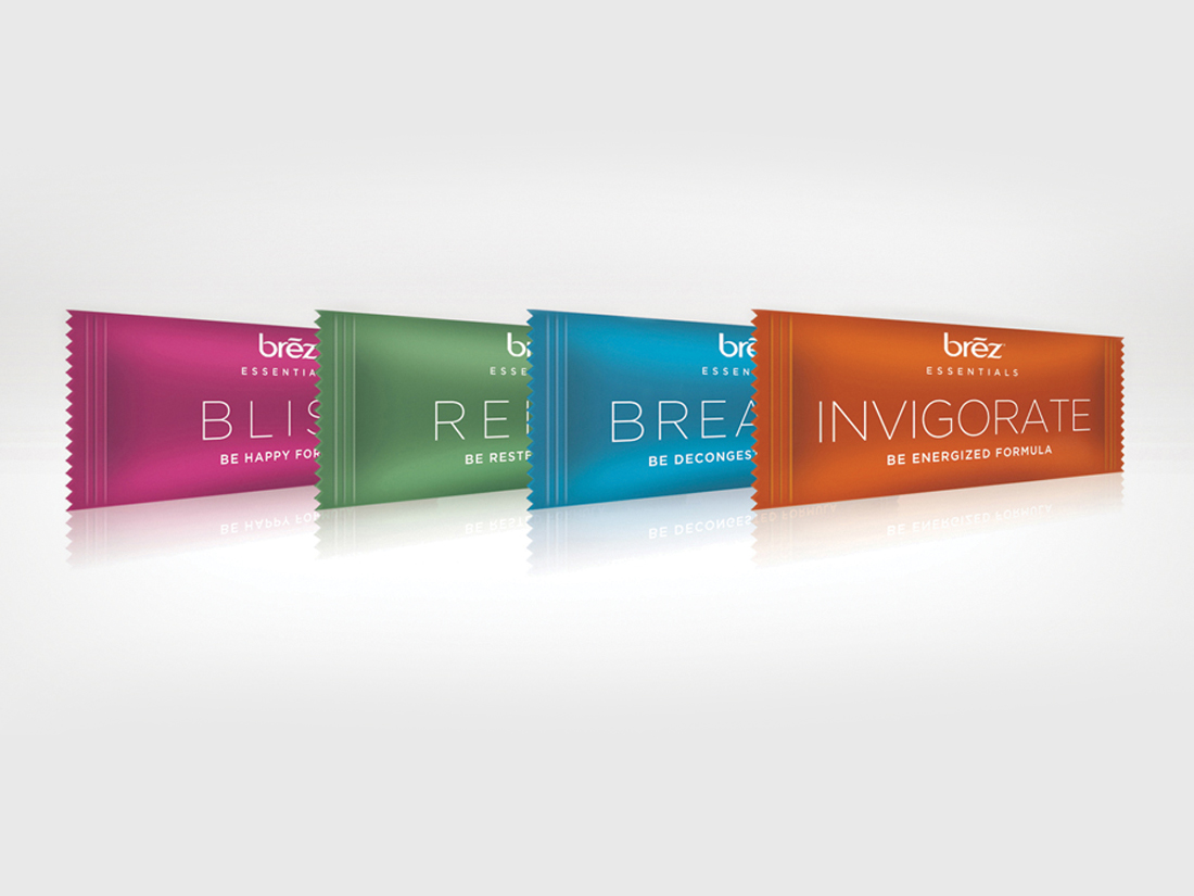
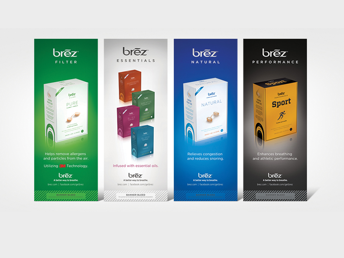
Originally positioned as a sleeping aid, Airware Inc., wanted to reposition their new product, Brez Essentials, as an upscale breathing supplement with essential oils that encourage various dispositions. Bright, cheery packaging was designed to offset the dominant white and blue color schemes of its counterparts to attract greater attention with minimal graphic noise. The simple, straight-forward design cleaned up the presentation and resonated with boutique salons and spas.
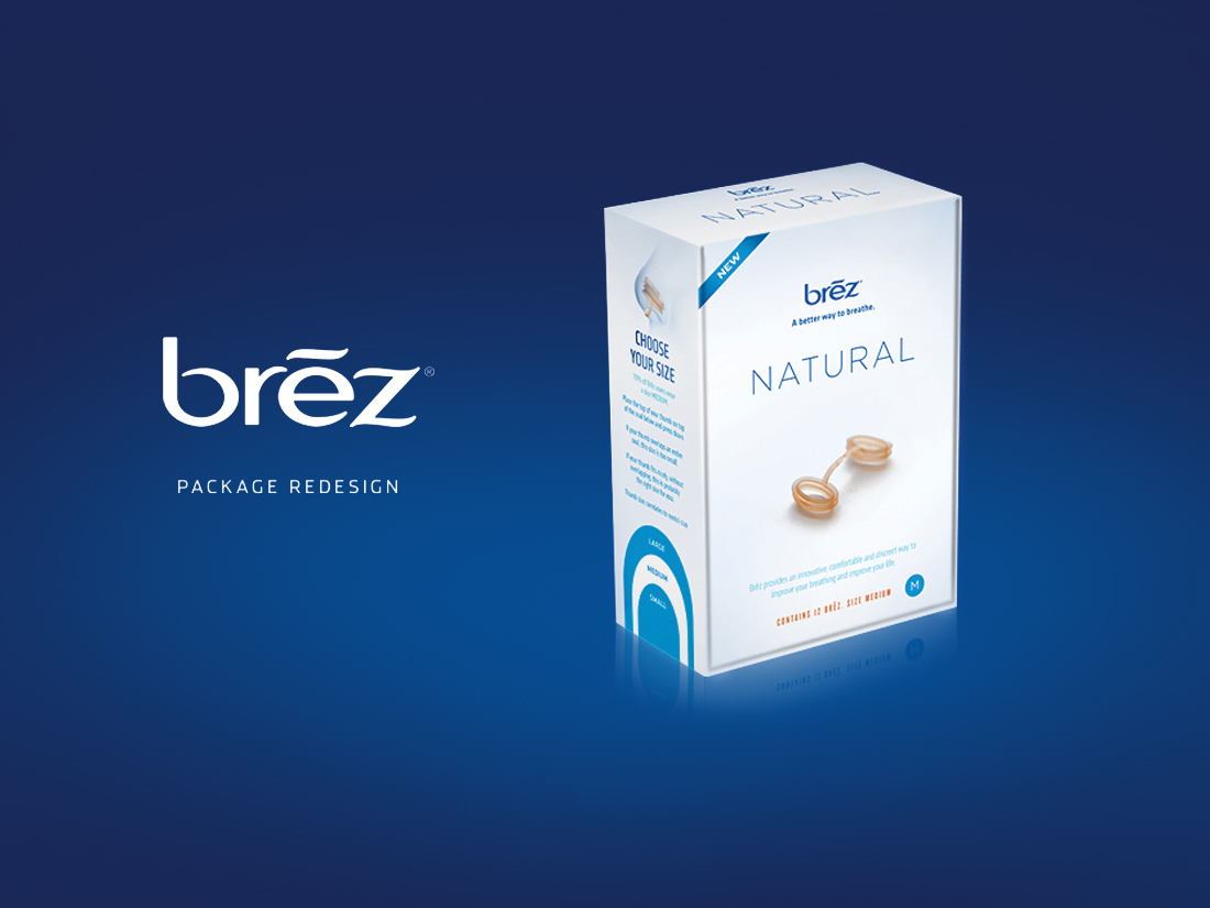
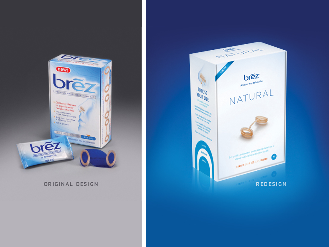
Once the Essential line was designed we used the same ethos to approach the original sleeping aid, changing the name to “Natural” to situate the product in context with its newly-formed scented product line.
Adjusting the brand
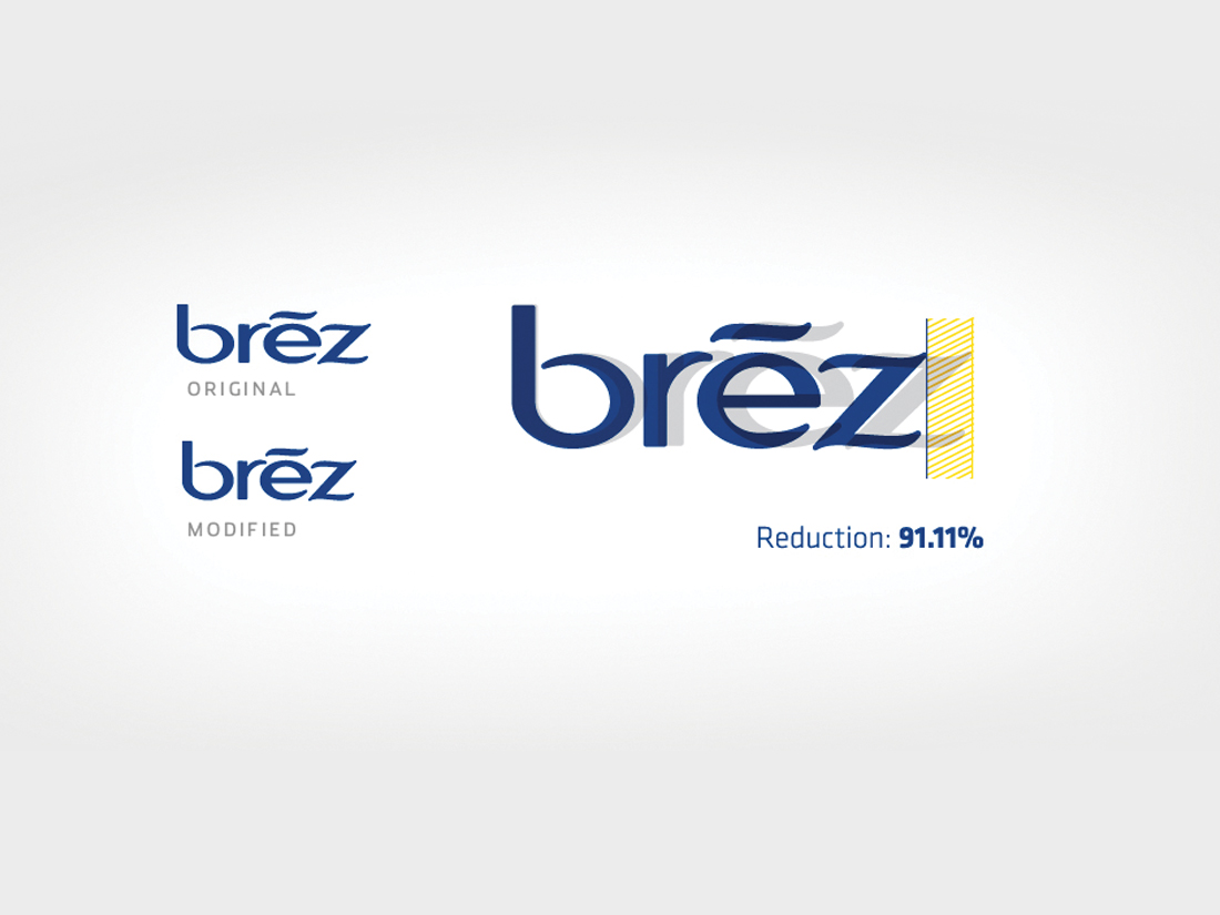
The original brand mark was positioned as a sleeping aid and so the elongated letter forms suited it well. Contrasted with the Essential product “Invigorate” the brand looked sluggish. Just a slight adjustment to the horizontal scale and the brand mark looked more perky, ready to meet the array of products to follow.
Client: Airware | Project: Brez Redesign, Conceptual work not finalized | Date: Fall 2011
Client
Airware
Category
Packaging, Photography, Redesign


